Boksak

Task

Boksak approached us to reimagine their brand with a complete refresh. The project included a new brand strategy, identity, and online presence, creating a cohesive and modern brand experience that better reflects the business and its offering.
  • Strategy

    Brand Strategy, Marketing Strategy

  • Design

    Art Direction, Conceptual Design, Branding

  • Client

    Boksak

  • Industry

    Outdoor, Hunting

BRAND VOICE

Boksak Identity

The original Boksak logo contained multiple visual elements competing for attention, making it difficult for the brand’s core message to stand out. Guided by the principle that less is more, we simplified the identity by focusing on the two elements most central to the brand: bok and sak. These were combined into a distinctive icon that forms the foundation of the new identity, paired with a custom-crafted wordmark designed to work seamlessly with or without a tagline. The result is a cleaner, more memorable brand mark that is both versatile and instantly recognisable.

Fuge-Boksak-Logo-Before

Before

Fuge-Boksak-Logo-After

After

Fuge-Boksak-ColourPalette
Fuge-Boksak-FullLogo
Fuge-Boksak-Billboard
Fuge-Boksak-Magazine
Fuge-Boksak-Ads-SideBanners
Fuge-Boksak-EmailSignature

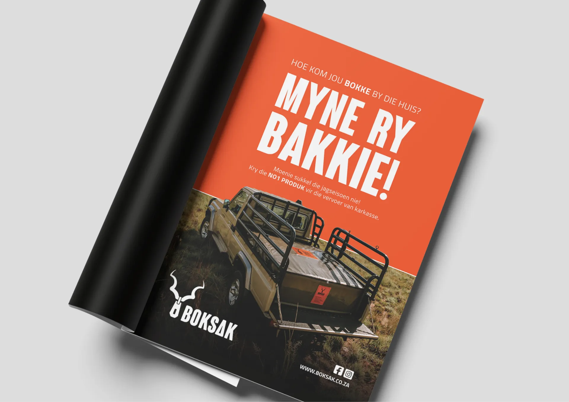
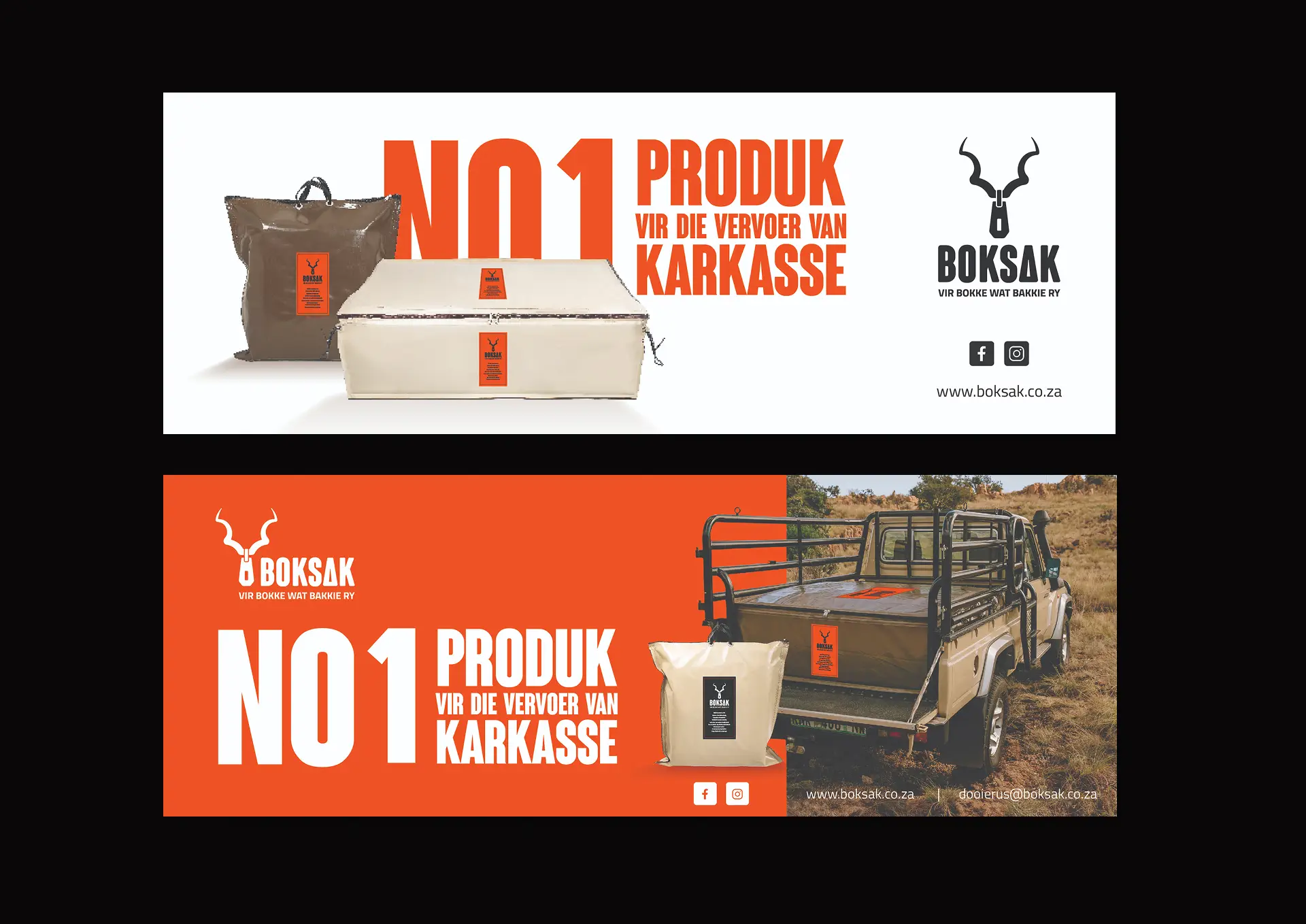
To connect with the primary target audience – the Afrikaans hunting community – Boksak asked us to create a range of adverts across magazine placements, billboards, and digital banners. We leaned into the brand’s playful side with the tagline “Vir bokke wat bakkie ry”, developing memorable campaign lines that felt true to the audience and easy to remember. The layouts were kept clean and focused, using minimal colour and giving the product the spotlight.

PACKAGING

Labels with
Relevance

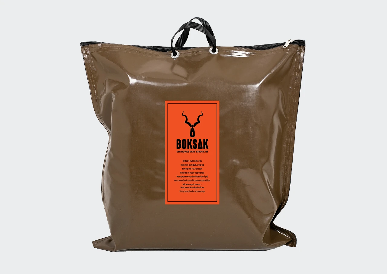
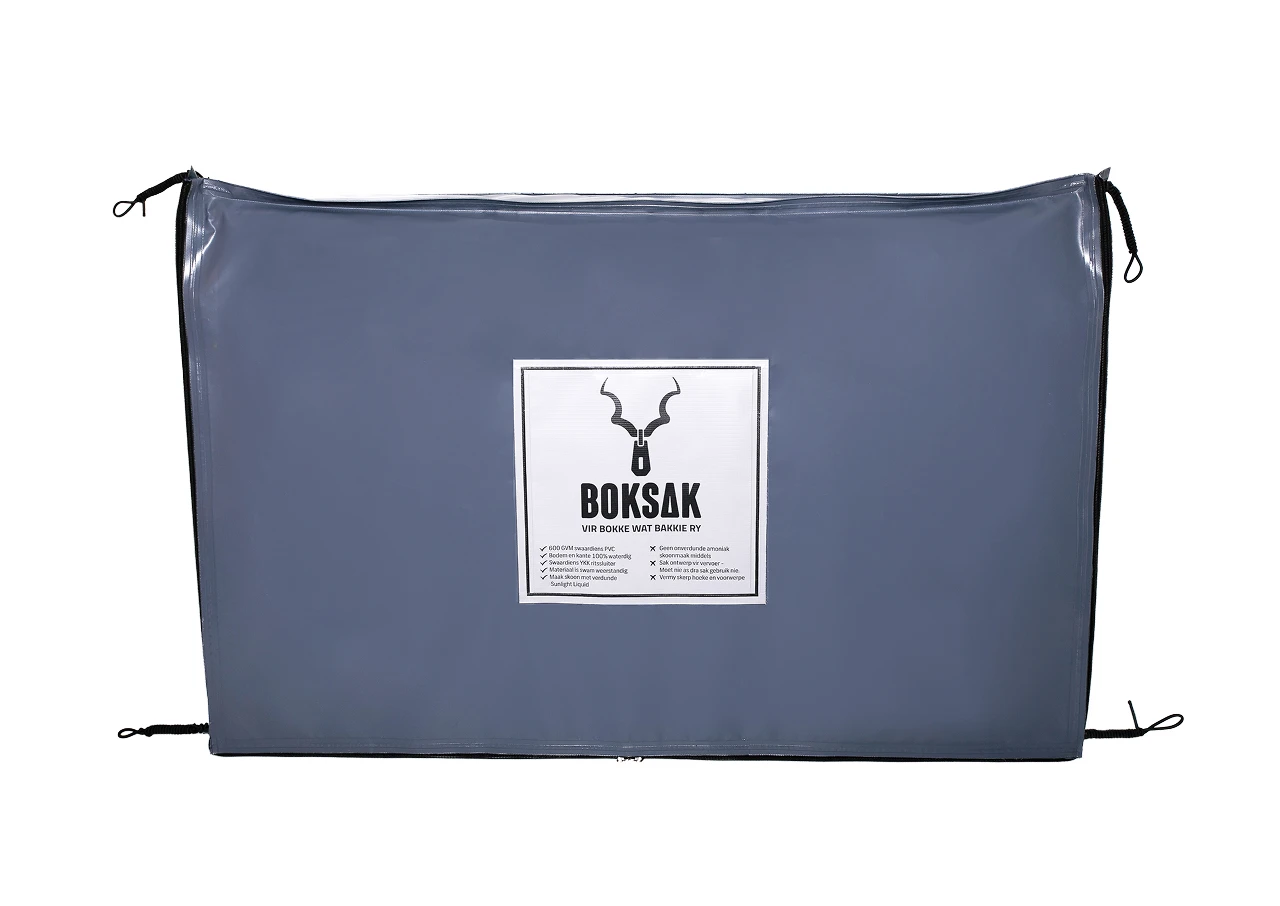
As part of the rebrand, we refreshed the product labels across the full range, using the primary orange, tan, and white colour palette to create a stronger presence and improve brand consistency.

As part of the rebrand, we refreshed the product labels across the full range, using the primary orange, tan, and white colour palette to create a stronger presence and improve brand consistency.

Fuge-Boksak-Bag-1
Fuge-Boksak-Bag-2
Fuge-Boksak-Bag-3
Fuge-Boksak-Website-1
Update Online

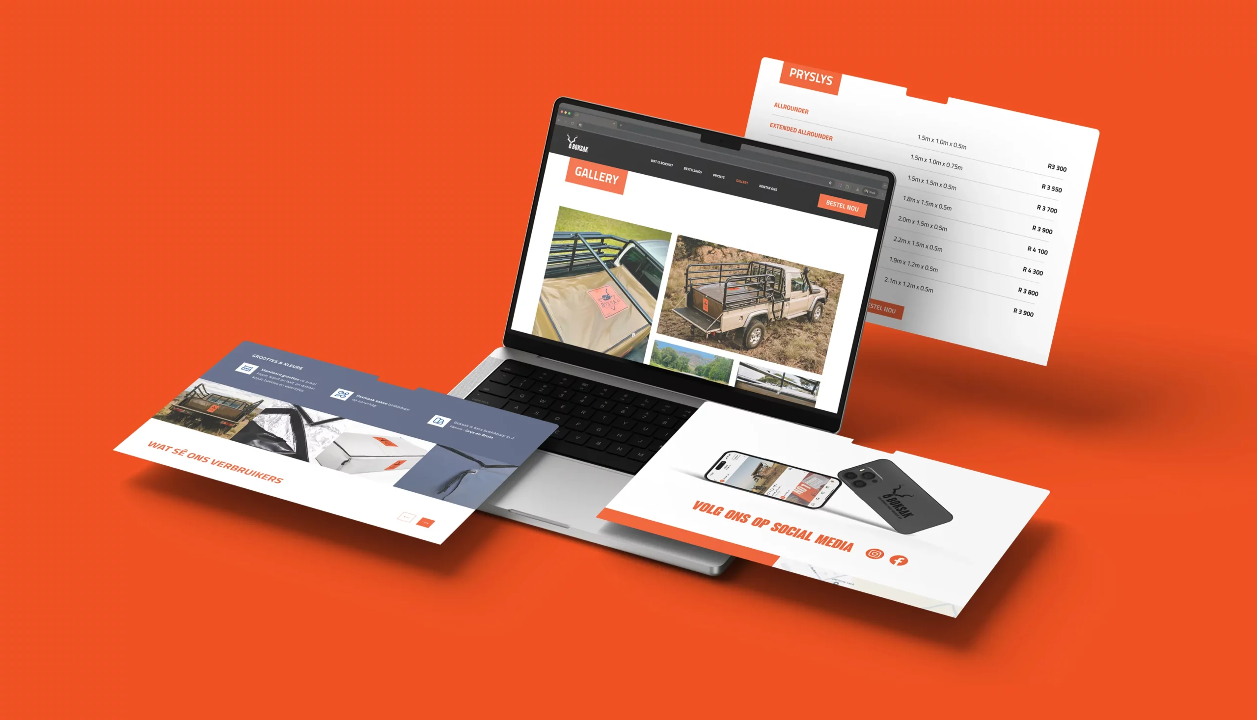
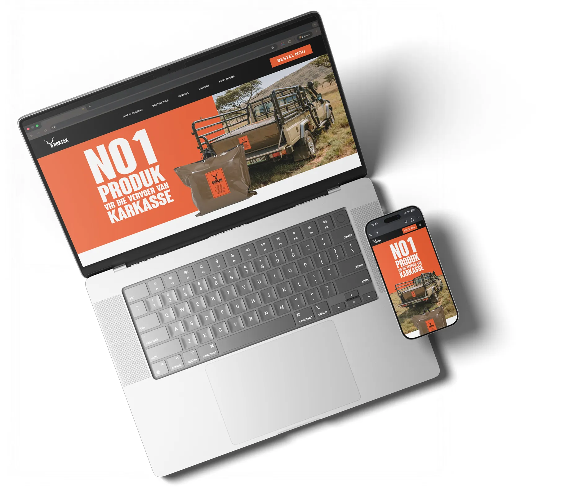
As part of the rebrand, we redesigned the Boksak website with a clean, straightforward user experience that could be easily managed and expanded by the client’s development team through WordPress.

The refreshed brand identity was carried through to the user interface, creating a consistent digital experience that feels both modern and approachable.

To encourage ongoing engagement, we recommended using social media as the primary gallery and community hub rather than duplicating content on the website. This approach creates a natural flow between the website and social platforms, driving interaction while keeping content fresh and easy to manage.

Fuge-Boksak-Website-2
Back